Wednesday, June 30, 2010

Southern France?

No, it's a sprawl-mall parking lot. Most days at lunch, I spend them in my car, drawing, till I fall asleep, returning to work with post-nap depression. I drew these trees in April, when it was a thrill to see leaves on trees! It is a sketch, though, and not a successful composition, since everything in the drawing is pointing to the right with nothing to reward the viewer once they're there.
Look, I'm trying to be open and honest and reveal sketches that work and some that don't . I'm not whining, in fact, a little disclosure is good for developing a comfortable relationship with other people. Think of it as a glimpse of the rapidly-aging-man-behind-the-curtain. I'm not so intimidating now, am I?

Tuesday, June 29, 2010

Another masthead

Same motivation as below, the composition I was looking for needed to fit a horizontal area. I tend to use the rhythm of repeated objects in compositions hence the bottom 3 knights.

Monday, June 28, 2010

Masthead

Sometime in April I was trying to update my letterhead on my DeviantArt page. I'm sure there was a valid idea here somewhere. I wound up using an old painting of mine.

Sunday, June 27, 2010

Figure, Ink 'n Brush

Last Thursday night's figure drawing session. Having been frustrated with the performance of my pen the week before, I took a brush with me this time. Size and the lack of time made a friend out of dry-brush.
If I get an influx of talent one of these days, I'll finish it.

Saturday, June 26, 2010

Figure, Pen n' Ink

Week before last, at the Thursday night figure drawing session. I decided to try my luck at pen and ink. I'd recently trained a Hunt 102 to be fairly cooperative at least on my sketch book, which has a smoother finish. The bristol I took to the drawing session had a vellum finish and probably a little more tooth than my pen nib was comfortable with. For the life of me I couldn't get light, delicate strokes- hence the detail in the hair where I could afford to be heavy-handed. Oh, well, worse things happen at sea .....

Friday, June 25, 2010

Cold Steel

I was stuck again, decided to draw a face, made it out of steel. I sure had fun with dramatic lighting though!

Thursday, June 24, 2010

Yep, a pinup

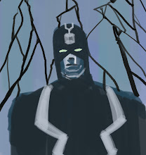
In my recent quest for fast cash, I thought of painting a Black Widow pin-up to ride the popularity of IronMan 2. Above, I'm noodling with a few poses. Of course, by the time I settle on a pose, a face, and a machine gun with a ridiculously long silencer, I've moved on to other pastures. I believe I've already crabbed earlier about how Gene Colan should be the only artist to do (draw I mean) Black Widow anyway, so I won't bother again. But it's still true.

Wednesday, June 23, 2010

The Cat, Fat

Topper next to me on the couch- an easy target.

Tuesday, June 22, 2010

What th' What?

Late March. I'm sure I was looking at Jack Kirby again. I've bought most of his Marvel output in the form of the Marvel Essentials collections and, of course, DC's Jack Kirby Library, The Jack Kirby Collector, etc. The "Marvel Essentials" are particularly appealing since they're reproduced in clean black and white- no half-tones or color to get in the way of Kirby's other-worldly design.
It'll affect my drawing for a couple of days, which can be frustrating ( 'cause nobody's that good!), but it's amazing how much it lifts my mood!

Monday, June 21, 2010

Up the Rebels!

More samples for Pearson Learning Group in New Jersey. I was trying to get illustration work in material with an historical slant. I made up a series of illustrations revolving around the Revolutionary War, since New Jersey was ground zero for most of it. I think I used a quarter as reference for Washington.

Sunday, June 20, 2010

Another

Guess who was running with a Mother's Day theme? Same batch as below, also selected by the company. Adorable!

Saturday, June 19, 2010

Mother's Day Card

Around '99 or 2000, a fellow Kubert School Alum's wife got a job as an art director for an online greeting card company. It's since gone out of business, but at my friend's encouragement I shovelled as many images as I could to them. They took some- I don't know if any sold. Above is an idea for a Mother's Day Card they accepted.

Thursday, June 17, 2010

Close-up

Same pose and angle as below, from last weeks drawing session. The model had a wonderful corkscrew mane, so I abandoned the drawing below and I decided to concentrate on hair. I tend to draw a bit more academic or conservatively at these sessions- not as loose as I'd like. I have to say that returning to figure drawing sessions has really cleared the cob-webs for me. A big thank you to Dave for making me go!

Wednesday, June 16, 2010

Figure Drawing

Last Thurs. figure drawing session. Another extended pose done in hard charcoal and china marker. I think I'm bringing ink with me tomorrow night.

Tuesday, June 15, 2010

Sepia Ship


Another sample from the same batch as below. In July or August of 2000, Geoff (a fellow Kubert School Lad) and I humped a proposal for a comic series all over the San Diego ComiCon. Geoff seemed to have the ability to shrug off rejection. Not me. I memorized the names of editors, prepared voodoo dolls in candle-lit basements, polishing my bitterness into a shiny ulcer.
You're probably curious now about the story.... the artwork's certainly intriguing. Well, if the publishers used better judgement when hiring editors, you wouldn't have to wonder.

Monday, June 14, 2010

Sepia Ink

From 2000, a sample I'd drawn up for a story a friend of mine and I were trying to get off the ground. I was in love with steel pens and brown ink at the time.

Sunday, June 13, 2010

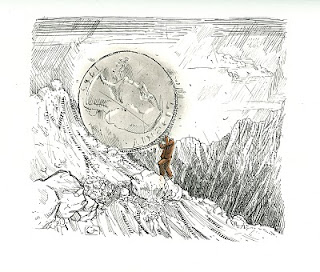
sysiphus

Around 2000 or so, I was ramping up a portfolio consisting of editorial pieces. I was concerned about finding a unique look, so I concentrated on an intaglio look. This is one of 2 I did with this "engraved" look.

Saturday, June 12, 2010

Lightbox

A spare doodle I did on a break during my animation days. Putting in 8-10 hours a day drawing over a light box can make anyone feel like a machine of sorts. Months spent drawing Daria for an MTV cd-rom game inspired many "Franken-Animator" drawings.

Friday, June 11, 2010

Aquatics

A few years back, working for Pearson Learning Group, specializing in educational material. I was asked to demonstrate the ability to portray children and people of various ethnic backgrounds. I thought I'd do both. The above with pencil and watercolor.
One of my assignments was to take a textbook written in Australia and adapt it for an American audience. Most illustrations in the book needed ethnic substitutions and disabilities represented. My instructions were typically: "Make the child with the beach ball Latino and the girl on the end needs to be in a wheelchair".
It was a fun assignment, and lucrative. I'm sure the idea of the assignment would make my current co-workers seethe with PC indignation!

Thursday, June 10, 2010

Different Angle

Same pose as below, other side of the room, same crappy camera. The model was squeezing sponges to keep her hands from exploding. Models deserve a special place in heaven! These sessions are designed for painters and portrait artists as they use the same pose over 2 weeks or so. The Artists Guild also offers another session of multiple poses, gestures, etc, aimed at us "drawers", but the personalities of the people who run that session bring an uneasy uptightness to the evening. For some reason, they take offense if someone leaves early. Who needs all those negative vibes bringin' you down when you're doin' art 'n stuff.

Wednesday, June 9, 2010

A Long Pose

A friend of mine recently bullied me into returning to evening drawing sessions sponsored by the St. Louis Artists Guild, and I'm glad he did! (Although it does cut into my drinking and TV watching). Now if he'd only bully me into buying a decent camera, I'd post better photos. I think it's china marker and a hard charcoal stick, 2 or 3 weeks ago.

Tuesday, June 8, 2010

Layout

From the late '90s, a sample from my animation layout portfolio.

Monday, June 7, 2010

Komrade Floursack

Last month I told a bitter-sweet story about life lessons from 2 of my former teachers. I mentioned how animation-instructor Doug Compton had been my living nightmare before wiping the Maya from in front of my eyes and revealing the truths of the universe. The "living nightmare" involved weeks of repeatedly drawing flour sacks. In traditional animation (before them computers did all the work) students would learn to animate form and weight by drawing flour sacks as substitutes for humans. It was thought they most closely resembled the American physique.
None of us realized how difficult this could be. Doug had us draw pages of flour sacks, rejecting them all. He was as disgusted with us as we were with him.
Thankfully, our storyboarding class gave me a chance to vent. I boarded a sequence involving a "Ministry of Animation" where the animators wore Soviet-style uniforms, drawing flour sacks and having them rejected by their cruel Komrade Supervisor. One night while the supervisor is working alone, he is attacked by living flour sacks brandishing an exacto-knife.
My storyboard instructor told me he could hear "The Sorcerer's Apprentice" in his head during the above sequence. While it was a big hit with the rest of my comrade-workers, it didn't earn me many maturity points at the Kubert School.

Sunday, June 6, 2010

Golden Avenger

Blue Pencil on Tracing Paper around 2003 or 04. I don't know why I prefer the old IronMan headgear. I think I automatically skew in favor of the '60's aesthetic. This is a layout I'd done on tracing paper, ready for transfer on to illustration board and painting. I should scan it into photoshop and have done with it already!

Friday, June 4, 2010

Pasta!

Sometime in late April, I was rifling through my son's school binder, trying to see if he's been writing about me behind my back. I found a drawing of his that really clicked with me. I stole it and tried to improve on it. Below is his original, above, mine. I think it's clear whose is better.

Thursday, June 3, 2010

An Oldie

From 96 or 97, a class assignment from the Kubert School. I think we were to pretend to be submitting ideas to the New Yorker, hence the ink wash on typing paper (note the savage buckling around the edges). New York had so many confusing and specific street signs and I wanted to use that in a cartoon. The instructor's note on the back says "I don't get it- but it seems funny- B+"